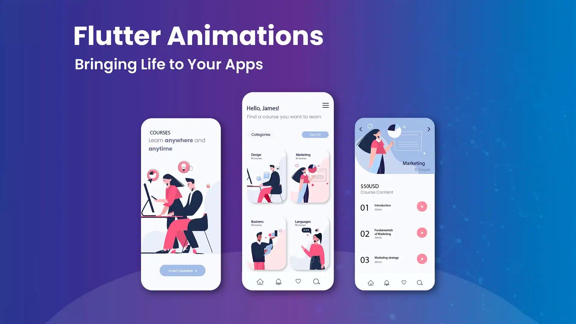
Flutter Animations: Bringing Life to Your Apps
27 June
In the world of mobile app development, animations play a crucial role in enhancing the user experience. They add a touch of interactivity, delight, and smoothness to your app’s UI, making it more engaging and visually appealing. Flutter, the cross-platform framework developed by Google, provides powerful built-in animation support, enabling developers to create stunning and dynamic animations effortlessly. In this blog post, we will explore the world of Flutter animations, from the basics to advanced techniques, and learn how to bring life to your apps.
Getting Started with Animations
Animations form the foundation of creating captivating user experiences. In this section, we will cover the basics of animations in Flutter and how to get started.
Animation Basics
To understand animations in Flutter, let’s start with some fundamental concepts. Animations consist of frames, duration, and easing. Flutter provides the Animation and AnimationController classes to manage animations. The Animation class represents a value that changes over time, while the AnimationController class controls the animation’s duration and progress.
Simple Animations
Creating basic animations in Flutter is quite straightforward. We can use the AnimationController and Tween classes to animate properties of widgets. For instance, you can animate opacity, position, size, and more. Let’s see an example of animating the opacity of a widget when a button is pressed:
// Declare the animation controller
AnimationController _controller;
Animation<double> _opacityAnimation;

@override
void initState() {
  super.initState();

  // Initialize the animation controller
  _controller = AnimationController(
    duration: Duration(seconds: 1),
    vsync: this,
  );

  // Define the opacity animation
  _opacityAnimation = Tween(begin: 0.0, end: 1.0).animate(_controller);
}

@override
void dispose() {
  _controller.dispose();
  super.dispose();
}

void _startAnimation() {
  _controller.forward();
}

@override
Widget build(BuildContext context) {
  return Scaffold(
    appBar: AppBar(
      title: Text('Flutter Animations'),
    ),
    body: Center(
      child: Column(
        mainAxisAlignment: MainAxisAlignment.center,
        children: [
          AnimatedBuilder(
            animation: _opacityAnimation,
            builder: (context, child) {
              return Opacity(
                opacity: _opacityAnimation.value,
                child: Text(
                  'Animated Text',
                  style: TextStyle(fontSize: 24.0),
                ),
              );
            },
          ),
          ElevatedButton(
            onPressed: _startAnimation,
            child: Text('Animate'),
          ),
        ],
      ),
    ),
  );
}
In this example, we define an AnimationController with a duration of 1 second. The opacity animation is defined using a Tween that interpolates values from 0.0 to 1.0. The AnimatedBuilder widget listens to the animation changes and rebuilds the widget tree accordingly. When the button is pressed, the animation starts, gradually increasing the opacity of the text widget.
Advanced Animation Techniques
Now that we understand the basics, let’s explore some advanced animation techniques in Flutter.
Implicit Animations
Flutter provides several implicit animation widgets that simplify the process of animating widget properties. These widgets automatically handle the animation transitions, making it easier to create smooth animations without explicitly managing AnimationControllers.
- AnimatedContainer: This widget automatically animates changes in its properties such as size, color, and alignment.
- AnimatedOpacity: It animates the opacity of a widget, allowing smooth fade-in and fade-out effects.
- AnimatedCrossFade: This widget transitions between two child widgets with a cross-fade animation.
Here’s an example of using the AnimatedContainer widget to animate the size and color of a box:
class AnimatedContainerExample extends StatefulWidget {
  @override
  _AnimatedContainerExampleState createState() => _AnimatedContainerExampleState();
}

class _AnimatedContainerExampleState extends State<AnimatedContainerExample> {
  bool _isExpanded = false;

  void _toggleSize() {
    setState(() {
      _isExpanded = !_isExpanded;
    });
  }

  @override
  Widget build(BuildContext context) {
    return Scaffold(
      appBar: AppBar(
        title: Text('Animated Container Example'),
      ),
      body: Center(
        child: GestureDetector(
          onTap: _toggleSize,
          child: AnimatedContainer(
            duration: Duration(seconds: 1),
            curve: Curves.easeInOut,
            width: _isExpanded ? 200.0 : 100.0,
            height: _isExpanded ? 200.0 : 100.0,
            color: _isExpanded ? Colors.blue : Colors.red,
          ),
        ),
      ),
    );
  }
}
In this example, tapping on the container triggers the `_toggleSize` function, which updates the `_isExpanded` boolean value. The AnimatedContainer widget animates the changes in size and color smoothly over a duration of 1 second.
Hero Animations:
Hero animations provide seamless transitions between two screens or widgets. They are commonly used to create visually appealing effects when navigating between pages or displaying images. The Hero widget in Flutter allows you to animate the transition of a widget from one screen to another.
Let’s consider an example where we want to create a Hero animation between two screens, transitioning an image from a list to a detailed view:
class ImageListScreen extends StatelessWidget {
  @override
  Widget build(BuildContext context) {
    return Scaffold(
      appBar: AppBar(
        title: Text('Image List'),
      ),
      body: ListView.builder(
        itemCount: images.length,
        itemBuilder: (context, index) {
          return GestureDetector(
            onTap: () {
              Navigator.push(
                context,
                MaterialPageRoute(
                  builder: (_) => ImageDetailScreen(image: images[index]),
                ),
              );
            },
            child: Hero(
              tag: 'image-${images[index].id}',
              child: Image.network(images[index].imageUrl),
            ),
          );
        },
      ),
    );
  }
}

class ImageDetailScreen extends StatelessWidget {
  final ImageModel image;

  ImageDetailScreen({required this.image});

  @override
  Widget build(BuildContext context) {
    return Scaffold(
      appBar: AppBar(
        title: Text('Image Detail'),
      ),
      body: Center(
        child: Hero(
          tag: 'image-${image.id}',
          child: Image.network(image.imageUrl),
        ),
      ),
    );
  }
}
In this example, the ImageListScreen displays a list of images, and when an image is tapped, it navigates to the ImageDetailScreen. The image widget inside the Hero widget is assigned a unique tag, which is used to match the widget between screens. As the transition occurs, Flutter automatically animates the image from the list to the detailed view.
Custom Animations
Flutter provides immense flexibility in creating custom animations using the AnimatedBuilder widget. This widget allows you to build your own animation by defining a custom animation function and updating the widget tree in response to animation changes.
Let’s consider an example of creating a custom animation widget that rotates an image continuously:
class RotatingImage extends StatefulWidget {
  @override
  _RotatingImageState createState() => _RotatingImageState();
}

class _RotatingImageState extends State<RotatingImage>
    with SingleTickerProviderStateMixin {
  late AnimationController _controller;

  @override
  void initState() {
    super.initState();
    _controller = AnimationController(
      duration: Duration(seconds: 2),
      vsync: this,
    )..repeat();
  }

  @override
  void dispose() {
    _controller.dispose();
    super.dispose();
  }

  @override
  Widget build(BuildContext context) {
    return AnimatedBuilder(
      animation: _controller,
      child: Image.asset('assets/images/image.png'),
      builder: (context, child) {
        return Transform.rotate(
          angle: _controller.value * 2 * math.pi,
          child: child,
        );
      },
    );
  }
}
In this example, the RotatingImage widget uses the AnimationController to control the rotation animation. The controller is initialized with a duration of 2 seconds and set to repeat the animation indefinitely. The AnimatedBuilder widget listens to the animation changes and rebuilds the widget tree by applying a rotation transformation to the image based on the controller’s value.
Performance Optimization and Best Practices
While animations are visually pleasing, it’s essential to optimize them for smooth performance. In this section, we will discuss some performance considerations and best practices for Flutter animations.
Performance Considerations
To ensure smooth animations, consider the following tips:
- Minimize unnecessary widget rebuilds by using const widgets or widgets that have a minimal rebuild impact.
- Avoid excessive or rapid state changes that can cause janky animations.
- Use the AnimatedWidget or AnimatedBuilder widgets to encapsulate specific parts of the UI tree that require animation updates, reducing the number of rebuilds.
Gesture-based Animations
Integrating user gestures with animations adds interactivity and enhances the user experience. Flutter provides gesture recognition widgets that can be combined with animations to create engaging interactions.
For example, you can use the GestureDetector and DragTarget widgets to create a draggable widget with animated transitions
class DraggableWidget extends StatefulWidget {
  @override
  _DraggableWidgetState createState() => _DraggableWidgetState();
}

class _DraggableWidgetState extends State<DraggableWidget> {
  double _xOffset = 0.0;
  double _yOffset = 0.0;

  @override
  Widget build(BuildContext context) {
    return GestureDetector(
      onPanUpdate: (details) {
        setState(() {
          _xOffset += details.delta.dx;
          _yOffset += details.delta.dy;
        });
      },
      child: AnimatedContainer(
        duration: Duration(milliseconds: 300),
        transform: Matrix4.translationValues(_xOffset, _yOffset, 0.0),
        child: Container(
          width: 100,
          height: 100,
          color: Colors.blue,
        ),
      ),
    );
  }
}
In this example, the DraggableWidget responds to horizontal and vertical pan gestures. The onPanUpdate callback updates the offsets, causing the AnimatedContainer to animate the translation transformation. As the user drags the widget, it smoothly moves along with the touch input.
Conclusion
Animations breathe life into your Flutter apps, making them visually appealing, engaging, and delightful for users. In this blog post, we explored the basics of animations, advanced animation techniques, and performance optimization. We covered simple animations, implicit animations, Hero animations, custom animations, and even touched on gesture-based animations. With the knowledge gained, you can now leverage Flutter’s animation capabilities to create stunning and dynamic experiences for your app users.
Remember to experiment, iterate, and let your creativity shine through your animations. Happy animating in Flutter!